Catalog layout with InDesign: 5 things to know
Designing a product catalog(whether it’s your company, or a customer’s catalog) with the right information is an important and responsible task.
The catalog is the business cardof the product: very often customers will buy or not the product based on how it is presented on paper!
In addition, you need to find the right balance between marketing information and technical information, to make sure your customer is satisfied and makes a clear decision.
In short … the layout of a catalog is not easy!
To give you a hand, we have decided to give you some tips to turn a long and demanding job into a task that you can carry out efficiently and safely.
In short … the layout of a catalog is not easy!
To give you a hand, we have decided to give you some tips to turn a long and demanding job into a task that you can carry out efficiently and safely.
1) Work with books
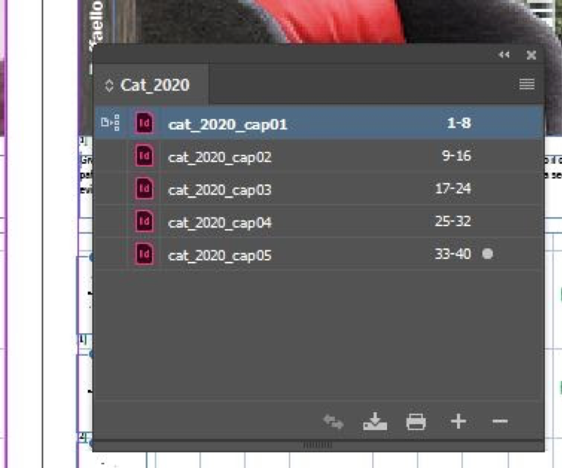
If you aren’t used to doing this already, divide your catalog into chapters. Save each chapter as a separate InDesign document and merge them with the Book feature.
So:
– you will work on a much lighter file;
– more people can work on the same catalog! While you take care of arranging the texts of the first chapter, your colleague updates the photographs of the second, and so on …
– No problem with page numbers! InDesign automatically numbers chapter pages after the first, even if they are separate files.
2) Use levels
Imagine your client has multiple versions of the same catalog (for example, an English translation, or the version with dollar prices, or both).
Have you kept a file for each version so far? there is a better way!
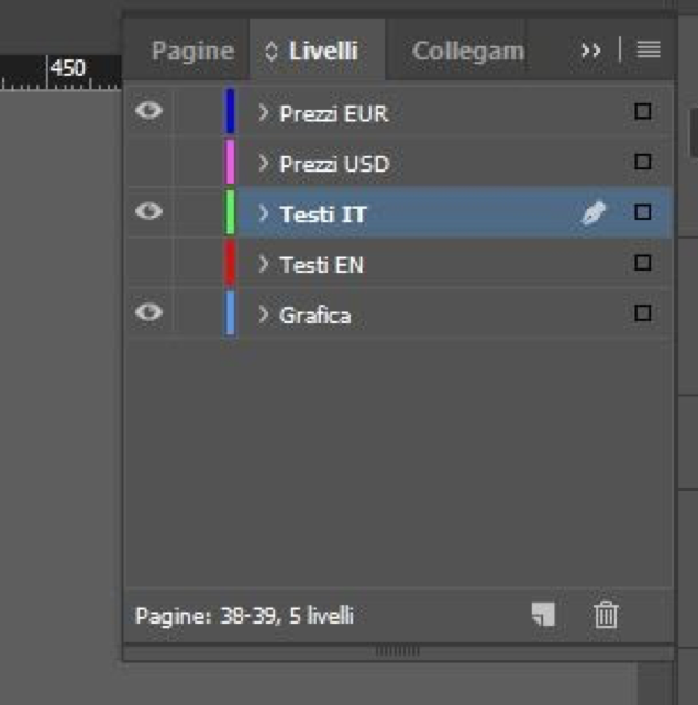
For example, you can keep graphics, descriptions in various languages and prices in different currencies on separate levels: thus, with a single layout, by activating or deactivating the levels, you can export different executives!
This trick can also potentially save you moneyin letterpress printing: we’ll talk about it in a future article!
3) Use styles
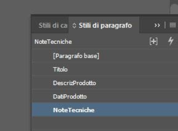
Using styles (table, paragraph and character) when designing catalogs can save you a lot of time, especially if the visual identity of your catalog is still being defined. This way, with one click, you can change fonts, embellishments, spacing and indents throughout the document. And if your client should think about a restyling in the future … your work will already be done!
4) Keep linked files in order
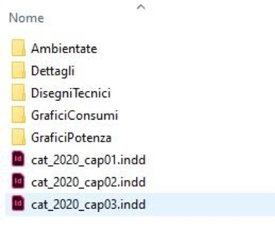
If you can, rename linked files consistently and keep them in separate folders by type (e.g. technical drawings, set photos, details). Don’t think “Then I’ll make a package, and it’ll all work itself out.” Why? I’ll explain it to you in a future article!
5) Beware of exports
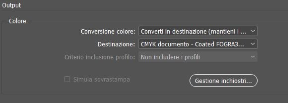
InDesign allows fine-grained control over export options, including PDF standards, color profiles, bleeds, and crop marks. If you are not accurate, you risk getting a completely differentpaper yield than what the customer expects.
If you are not sure about the rules to follow, consult your printer or that of your client: remember, once the ink is on paper … it’s done!
If despite these tips you think that the layout of catalogs is still a heavy job and full of responsibility … you are not completely wrong!
On Page has a solution to make your layout easy to create and update, saving you time and money, find out how!
Other articles that
may interest you


